What White Space Is
In the context of web design, white space (or negative space) is the space around and between elements on a page. To non-designers, it may seem unnecessary or an expression of a particular aesthetic (and therefore non-essential to a web page). To designers, it is an essential tool to increase the comprehension of a composition and guide a viewer’s attention and focus.
What White Space Does
While white space may evoke a sense of elegance and sophistication, that is not its primary purpose from the perspective of user experience. White space helps the user understand the interface without undue effort; it reduces cognitive load and, as a result, greatly improves the quality of the experience.
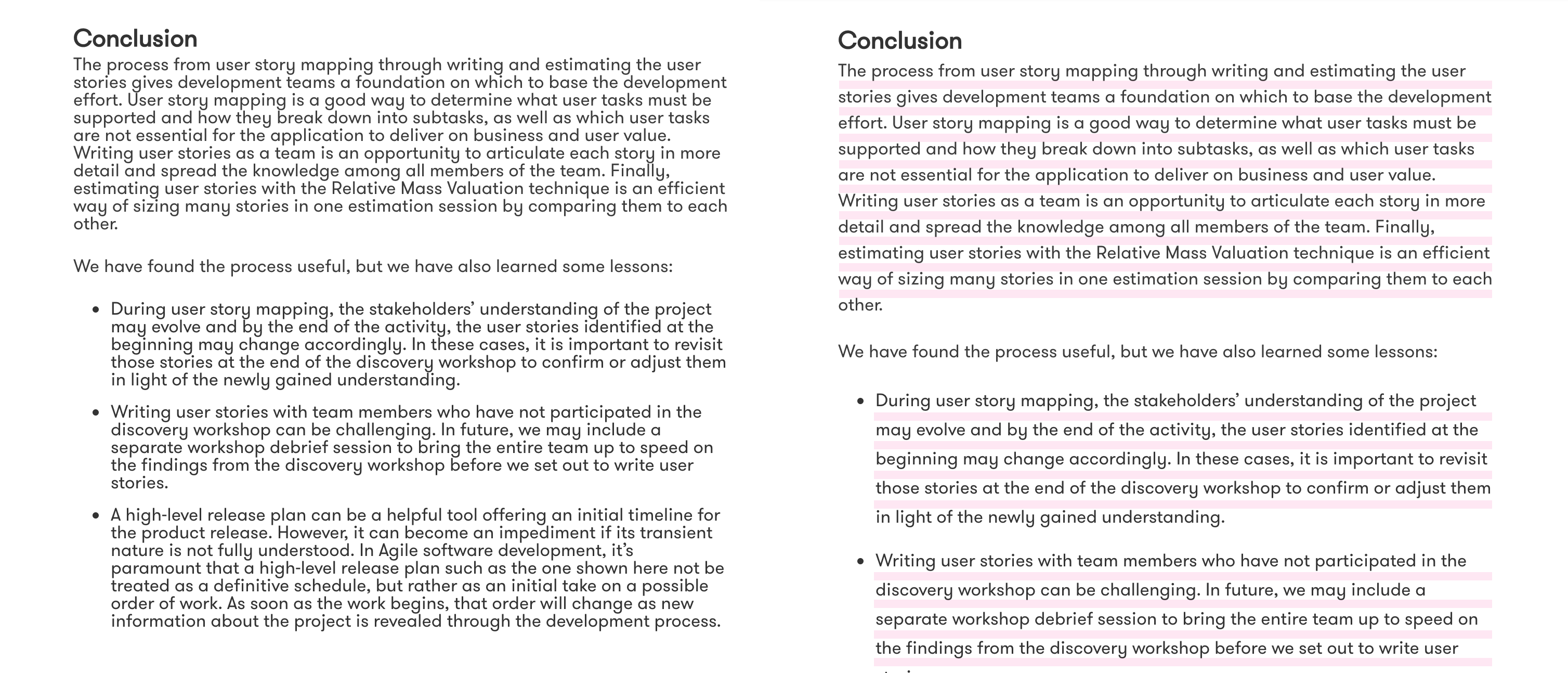
Micro white space – the white space between smaller elements on the page (e.g., characters or lines of text) – improves legibility.
 _Screenshots of two versions of the same web page with different amounts of micro white space in line height): image on the left shows insufficient line height, image on the right shows a comfortable line height._
Macro white space – the white space between and around larger interface elements (e.g., paragraphs of text or graphics) or groups of elements (e.g., a section of an article or a web form) – helps direct attention to those elements and improves comprehension. For example, a study by Dmitry Fadeyev demonstrated a twenty percent increase in comprehension due to proper use of white space between and around text elements.
 _Screenshots of two versions of the same web page with different amounts of macro white space (margins between paragraphs and list items): image on the left shows lack of margins, image on the right shows paragraphs and list items separated by margins._
How White Space Works
White space works to improve legibility and comprehension in three major ways. It:
- reduces cognitive load by decreasing clutter and increasing scannability of a web page;
- clarifies relationships by fostering the perceptual principle of proximity; and
- guides attention and focus by strengthening visual cues that support figure-background separation.
White space reduces cognitive load by increasing scannability of a web page
Properly applied white space supports scannability, an objective long postulated by Nielsen Norman Group (NNGroup). The results of their study from 1997 still hold true today: most users do not read web pages word-by-word. Instead, they scan them for specific words and sentences.
Separating chunks of text by a sufficient amount of white space makes scanning easier, thus decreasing the amount of strain the user experiences in search for content they seek on a page.
White space clarifies relationships by fostering the perceptual principle of proximity
Two Gestalt principles of perception – proximity and figure-background – rely on white space.
The principle of proximity states that “objects that are closer together are perceived as more related than objects that are further apart”[1]. That means that by increasing white space between elements on the page, we signal to the user that those elements are less (or not) related to one another. By bringing elements closer together, we indicate they have a closer relationship.
Consider the following web form example. The even spacing between form elements on the left offers no visual cue about their relationships. On the other hand, an increase in white space between form sections on the right (accompanied by an appropriate use of headings) makes relationships between those elements much clearer.

White space guides attention and focus by strengthening visual cues that support figure-background separation
The figure-background principle states that “elements are perceived as either figure (the element in focus) or ground (the background on which the figure rests)”[2]. Whether we perceive something as a figure or its background is a result of how our brain interprets cues carried by objects of perception. Size, color, and edge are among visual properties that help us interpret an object as a figure. And a figure is where our attention tends to focus. By skillfully applying white space, we can therefore direct the user’s attention to parts of a layout we want them to look at, and guide them through an interface to tasks we want them to complete on a page.
Consider two search engine pages shown below. The amount of white space the Google page employs leaves no ambiguity about what user action should be taken.
 _Screenshots of search engine pages: Yahoo on the left, Google on the right._
Conclusion
At an intersection of design and development, compromises must be made to meet budgetary constraints and deadlines. At the same time, we must recognize that many design choices in areas of web and user interface design are about minimizing cognitive load and facilitating comprehension. The long-term benefit of retaining and attracting users outweighs short-term cost of a precise implementation of design choices critical to quality of user experience. White space is an important aspect of improving user experience, but it’s not the only one. Learn more about principles of good user experience from an earlier blog post.
1: “Design Principles: Visual Perception And The Principles Of Gestalt: Proximity,” Steven Bradley, Smashing Magazine, March 28, 2014.
2: “Design Principles: Visual Perception And The Principles Of Gestalt: Figure/Ground,” Steven Bradley, Smashing Magazine, March 28, 2014.