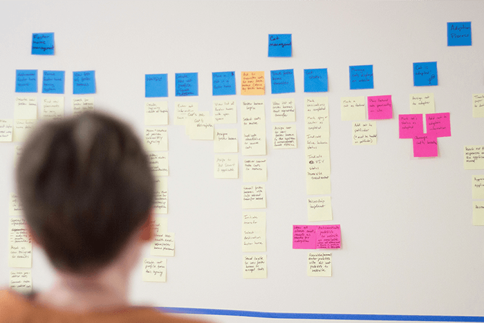
Designing navigation that will support the needs of website users is one of the more important aspects of site usability. At Caktus we practice iterative, user-centered navigation design, which includes user feedback.
Identify Content Categories Through Card Sorting
Before devising a way for users to navigate content, it’s a good idea to make sure that the content is organized in a way that makes sense to them. Better yet, find out how users would categorize content. One way to do this is through card sorting.
There are three methods to carry out a card sorting study:
- Open: Make a list of labels representing pieces of content and let users create and name their own categories to organize the labels.
 Screen capture of an open card sorting interface in OptimalWorkshop.com
- Closed: Provide users with a list of categories along with the labels representing the pieces of your content, and allow them to categorize the content labels into the provided categories.
 Screen capture of a closed card sorting interface in OptimalWorkshop.com
- Hybrid: Provide a set of predetermined categories and allow users to create their own categories. Let them organize content labels into the predetermined categories and/or their own categories.
 Screen capture of a hybrid card sorting interface in OptimalWorkshop.com
A card sorting study will reveal how users think about categorizing content. It can be conducted with index cards or sticky notes, or with a digital tool. Advantages that digital tools offer include the ability to conduct remote studies and a quick analysis of results. For example, they can display the results of a card sort as a matrix showing what percentage of users placed which piece of content into which category. At Caktus, we use OptimalWorkshop for card sorting, as well as for treejack and first-click testing (described below).
Pro tip: If, prior to card sorting, you have already established guidelines for controlled vocabulary on your website, a closed card sorting may be a good choice. If you are still deciding on terminology, learning the words your audience uses to describe your content in an open card sorting study may help to provide invaluable insights.
 Screen capture of Popular Placements Matrix in OptimalWorkshop.com
Validate the Content Organization Through Treejack Testing
Once you come up with the first iteration of content organization, it is a good idea to validate that content structure through treejack testing (also known as “reverse card sorting”).
In treejack, you build a tree-like structure out of labels representing content. A treejack consists of nested levels of content labels that mimic your intended information architecture. During the test, users are asked to find specific pieces of content within that tree.
 Screen capture of a treejack interface in OptimalWorkshop.com
If the treejack is based on results from a card sorting study, you might expect that users find content labels exactly where you put them. Let go of that expectation. No classification of content you may come up with, even with the help of users, is going to be perfect. It’s more useful to think of treejack as another opportunity to refine your content organization.
Pro tip: What if the results of a treejack test contradict the results of a card sorting study? That may happen, especially if both studies are qualitative, meaning that they rely on a small sample group of users. That means your job is not done, and you should continue to tweak and test.
Continue with First-Click Testing
When searching for content on a live website users rely on a number of cues offered by good design. Those cues are absent in treejack testing and that may be a factor preventing users from being successful. Continue testing content organization by giving the users additional context. Asking users where they would click within a static mockup to find a specific piece of content can offer insights into users’ mental models. This may help resolve any ambiguities between card sorting and treejack testing.
Pro tip: When coming up with tasks for a first-click test, avoid using words that are present in links and buttons in the interface design that you are testing. For example, if you are testing a “Contact Us” button, don’t ask the user, “Where would you click to contact this company?” Instead, ask, “Where would you click to get in touch with this company?” Also, avoid asking leading questions. For example, instead of asking, “Would you look for squash under vegetables or under meat?” ask, “Where would you click to find squash?
 Screen capture of a first click testing interface in OptimalWorkshop.com
Conduct Usability Testing on a Live Interface
By the time a design is translated into code, it should have iterated on the organization of content and the navigation pattern based on results from card sorting, treejack, and first-click testing. Now a live interface can be tested, which adds a new dimension that may facilitate or hamper users’ ability to navigate. Usability testing on a live interface is a chance to find out how your design decisions hold up.
 Image source: Validately.com
Pro tip: If previous user tests left you with unanswered questions about content categorization, begin by focusing on tasks that will help you resolve those questions. Use the same or similar tasks to those you gave users during the first-click testing. Pay attention not only to what users do, but also to what they say in order to understand the mental models that guide their interactions with the interface.
Takeaways
The process of organizing content and identifying navigation patterns that will support user goals is messy (learn more about how to make sense of any mess from Abby Covert). There is no perfect solution. The best option is to identify common mental models and patterns, and find your content structure and navigation pattern in that knowledge. The tricky part in qualitative studies is to figure out what is a quirk and what is a pattern. Repetitive testing with a small sample group of users is a good way to come closer to the answers you seek.
Interested in learning more about UX? We have posts about product discovery, the principles of good UX design, user story mapping, and more.

