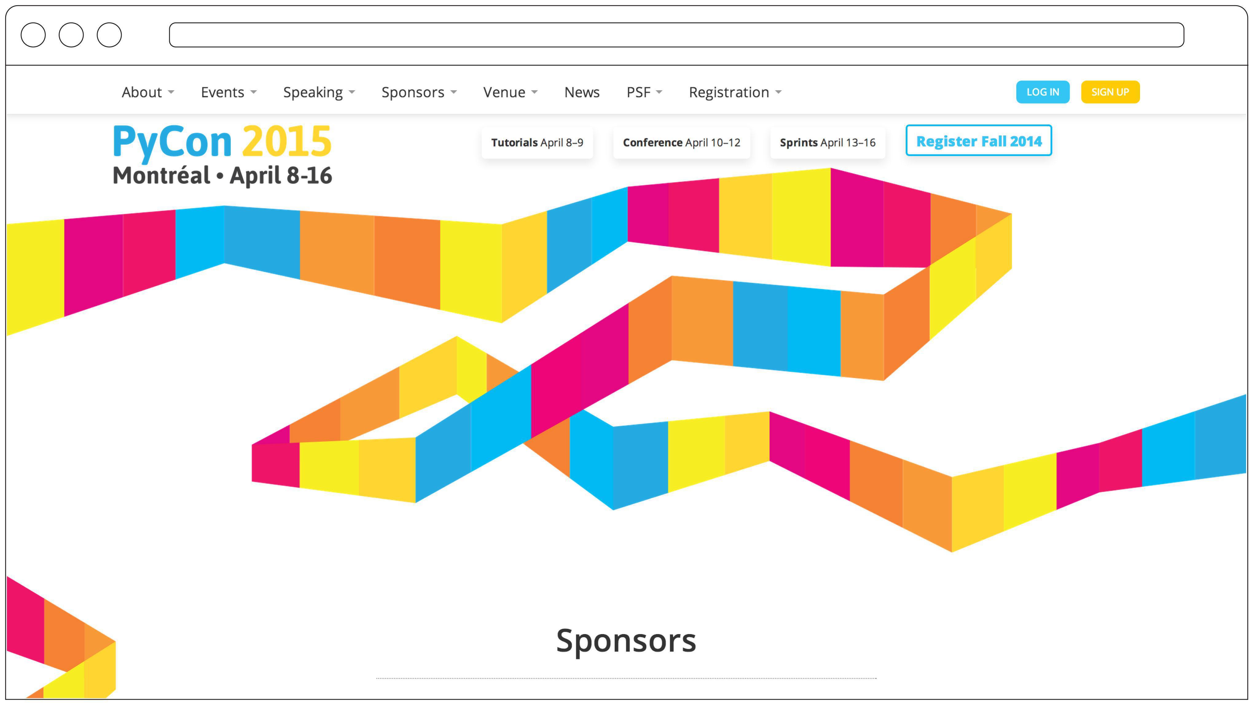
PyCon 2015’s website launched today (a day early!). PyCon is the premiere conference for the Python community and one we look forward to attending every year. We’re honored that the Python Software Foundation returned to us this year to revamp the site. We were especially happy to work again with organizer-extraordinaires Ewa Jodlowska and Diana Clarke.
One of the most exciting things for our team is turning ideas into reality. The organizers wanted to retain the colorful nature of the PyCon 2014 site Caktus created. The also wanted the team to use the conference site, the Palais des congrès de Montréal, as inspiration (pictured below). The new design needed to pay homage to the iconic building without being either too literal or too abstract.

The design team, led by Trevor Ray, worked together to create the design using the stairs as inspiration (seen through the photo above). The stairs allowed a sense of movement. The colored panes are linked in a snake-like manner, a nod to Python’s namesake. If you look carefully, you will also see the letter P. Working in collaboration with the organizers, the team created multiple drafts, fine-tuning the look and feel with each phase of feedback. The final design represents the direction of the client, the inspiration of the building itself, and the team’s own creativity.
In addition to refreshing PyCon’s website, our developers, as led by Rebecca Lovewell, made augmentations to Symposion, a Django project for conference websites. We’ve previously worked with Symposion for PyCon 2014 and PyOhio. For this round of changes, the team used these previous augmentations as a jumping off point for refinements to the scheduler, financial aid processing, and sponsor information sharing.
Up next? A conference t-shirt!


